It’s more than a tagline. It’s the total experience you have when you see or hear “Delta Gamma.” Our new brand launched on June 25, 2020 and is truly authentic to who we are. It’s the simplest expression of what Delta Gamma stands for. Elements like our bronze, pink and blue colors, the anchor, and “Do Good” will never change – but our brand, and how we position ourselves will always evolve.
We partnered with a branding agency who held many interviews with members, partook in tours of our archives and researched other women’s groups. Then, they went to work creating messaging and visuals for us to share with you all. This new brand helps set us apart in today’s era.
All of the research boils down to this positional statement to define what sets us apart:
Delta Gamma exists to empower women to act with intention so that they become an unstoppable force for good.
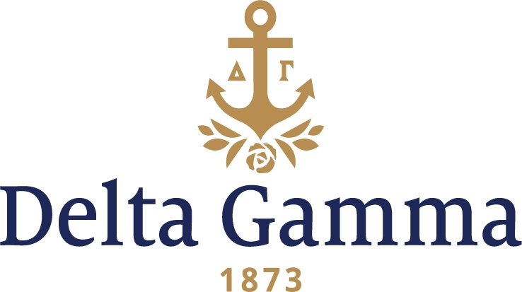
“Do Good” is what consistently resurfaced within each interview and archives visit our agency held. This motto played a major role as we refined our brand and identity for today and tomorrow. We took our classic symbols, colors and imagery and modernized them, creating a fresh new look.
We knew our logo needed to stay traditional and timeless, but also needed to represent some new initiatives that are important to Delta Gamma today. In 2007, our For Hope, For Strength, For Life logo debuted and served us well. But now we were looking for something that could flex to more audiences and platforms. After many interviews archives visits, our branding agency determined that including the rose, as well as our founding year was important to add strength and longevity to the brandmark. You will notice there is no motto within the mark. That decision was made to prevent us from being boxed in to a specific tone. This brand has the ability to grow and flex with us as years go by. Another edition, to help set us apart, is the leaves growing from the logo. The meaning behind both the rose and new laurels is to exemplify the growth a woman experiences through her life as a Delta Gamma.
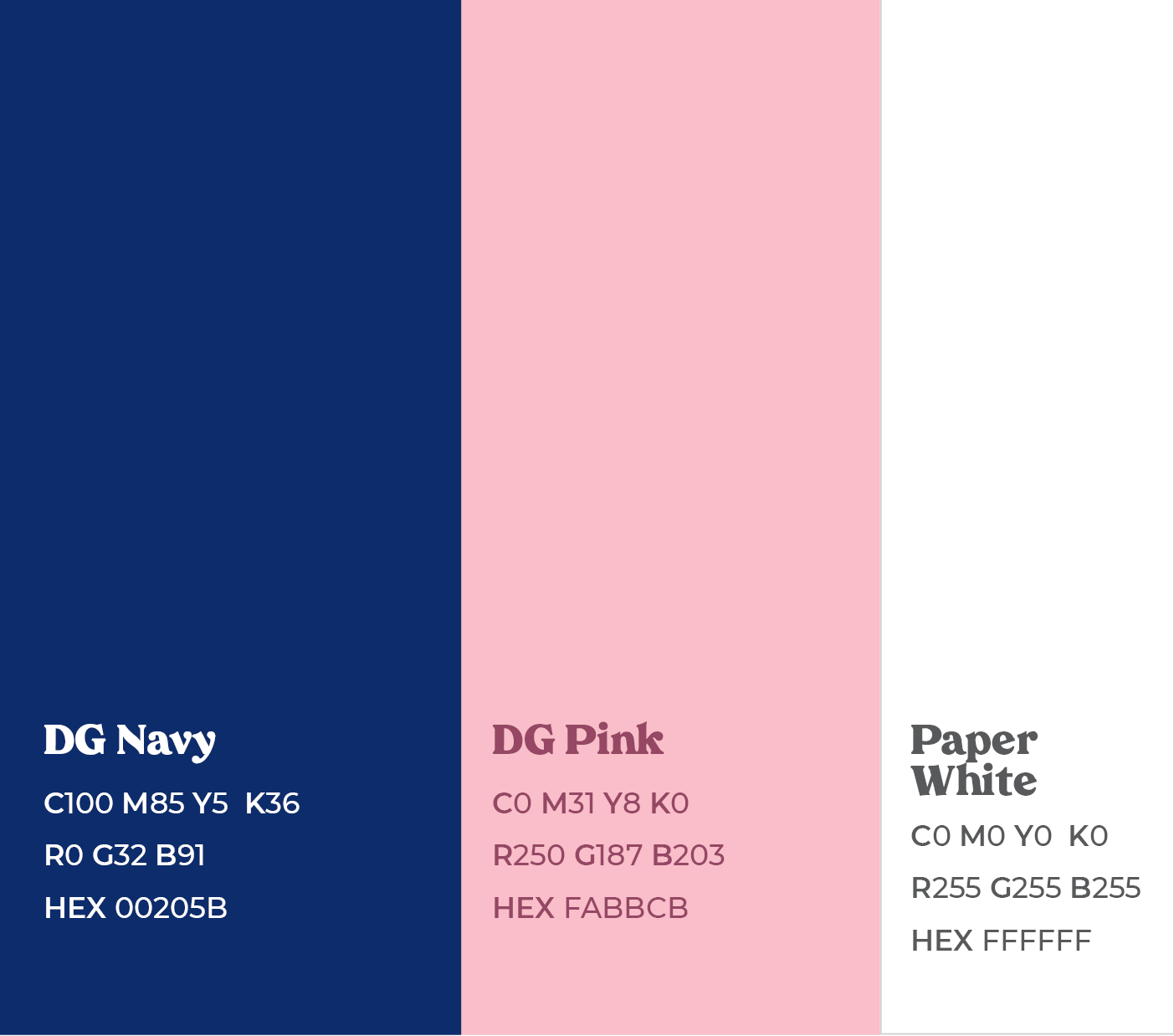
Of course, our colors will always be Bronze, Pink and Blue. Within this brand you will see that our navy remained the same (now called DG Navy), to help with that consistent voice. DG Pink and Paper White are both colors that work well with the DG Navy and help give us a clean and modern appeal. Download the Branding Guidelines here.

Questions about the brand? Check our Frequently Asked Questions. Want to download the new brand elements for yourself? We thought so. Find them here.